Matthew Gotham
Blog
The Impact of the NHS on Child Mortality and Life Expectancy
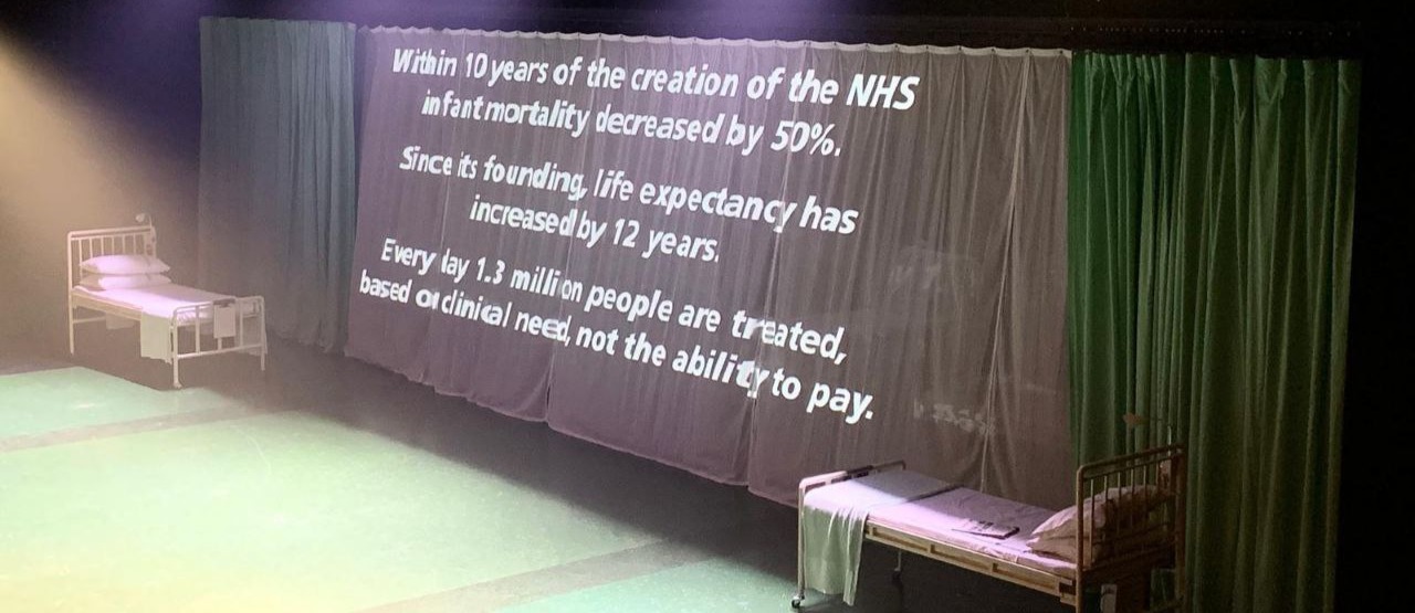
One of my relatives shared this photo, from the end of a production of Nye that she saw at the National Theatre, with the family WhatsApp group:
Given that I’ve looked into the mortality rates in England and Wales before, I thought I’d be able to put these figures into context.
Infant Mortality
First of all, the infant mortality rate. Here’s a scatter plot showing all the figures available in the Human Mortality Database for deaths under the age of 1 in England & Wales:
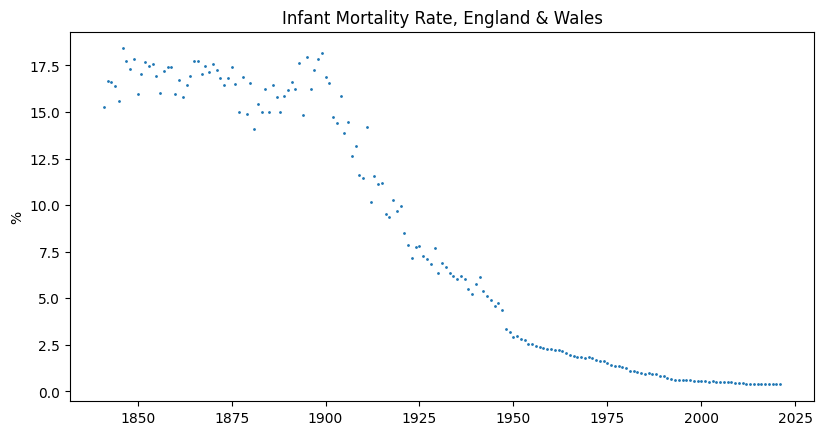
We can see that a really precipitous decline in infant mortality began at the turn of the 20th century, due (I think) to breakthroughs in the understanding of hygiene. Has the founding of the NHS in 1948 had a noticeable effect on that trajectory? There does seem to be a secondary drop-off in the late 1940s, which the following chart hopefully makes clearer:
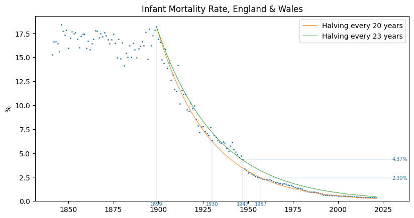
The infant mortality rate dropped by 45% from 1947 to 1957, so the first statistic on the theatre curtain is... close enough to the truth, I think. Looking at the data in terms of exponential decay since the turn of the century, in 1948 the decrease in infant mortality got back onto the trajectory it was on in 1930. Maybe we should be thinking more about what happened in the period 1931–1947...?
Life Expectancy
Here’s a plot of the life expectancy figures, from the same source:
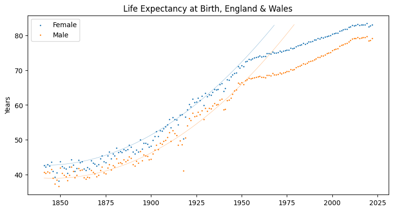
Over the first 100 years of the data set, life expectancy for both men and women shows quadratic growth (which is what the lines plot), but this trend seems to change in the early 1950s. While it’s true that life expectancy has increased by about 12 years since the founding of the NHS in 1948, if you looked at the chart above and were asked what happened in the late 1940s, you would have to say that something slowed the rate of increase in life expectancy!
Conclusion
Of course, I don’t think the NHS can blamed for the fact that female life expectancy in England & Wales isn’t 125 yet, which is what the 1840s–1940s trend would have led to. I also don’t think it can be credited for what increase in life expectancy there has been since 1948; and I’m not sure about the decrease in infant mortality, either. To get a better idea, the next step would be to do a comparison between E&W and another country with similar figures in the 1840s–1940s period.
The code for producing these charts is available in the connected GitHub Repository.